Red Plus Green Paint Mixing Fact-Check: Light Physics vs. Physical Pigment
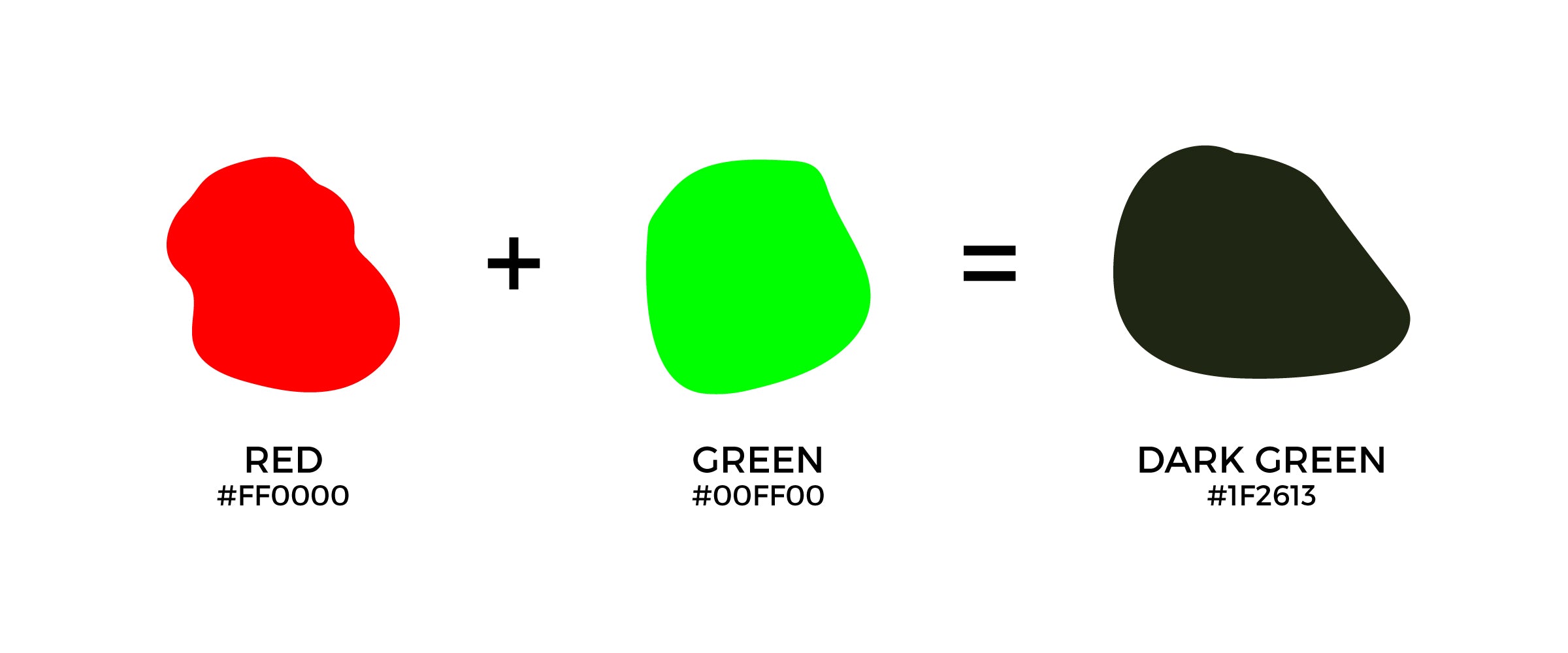
Squeeze cadmium red into phthalo green on a wooden palette, swirl them together with a palette knife, and you get a dense, earthy brown or muted chromatic gray. Project a beam of pure red stage light across a beam of green light, however, and your eyes register bright yellow. That physical divergence fuels persistent confusion across art studios, digital design schools, and web forums. Understanding visual perception requires examining both neurological responses and spectral mechanics, as detailed in a Verywell Mind report tracking how color stimuli influence human cognition and visual comfort. When painters ask what color red and green paint make, physical chemistry delivers an unequivocal answer: paint yields brown or neutral gray, never yellow.
📌 Key Takeaways:
- The Direct Result: Mixing red and green paint yields brown, ranging from rich raw umber tones to slate-tinted chromatic grays depending on pigment transparency and ratios.
- The Physical Mechanism: Paint operates under subtractive color mixing, where combined chemical compounds absorb more light wavelengths and reflect fewer back to the human eye.
- The Digital Confusion: Additive light physics in the RGB color spectrum produces yellow from overlapping red and green photons, creating a clash with physical RYB studio practice.
Why Screens and Pigments Tell Conflicting Visual Stories
The widespread belief that mixing red and green might generate yellow stems directly from modern screen culture. Every smartphone, computer monitor, and television display relies on the RGB color spectrum. These displays operate through additive light physics. In an additive system, the starting point is total darkness, a black screen. Photons of varying wavelengths are emitted directly from tiny light-emitting diodes toward your retina.
When your eye receives red wavelengths (around 620, 750 nm) and green wavelengths (around 495, 570 nm) simultaneously, the light stimulates both your long-wavelength (L) and medium-wavelength (M) retinal cones. The human brain interprets this dual stimulation as yellow. In additive systems, adding more light wavelengths moves the mixture toward white.
Physical paint works under the opposite physical rules. Acrylic, oil, and watercolor formulations consist of ground chemical particles suspended in a binder. The starting point is white canvas or paper, which reflects all ambient visible light. When ambient light strikes a painted surface, pigment absorption removes specific wavelengths. What your eye perceives is merely the leftover light that managed to bounce back off the canvas.
The Mechanics of Subtractive Color Mixing
In subtractive color mixing, combining pigments stacks absorption filters on top of one another. Red paint appears red because its chemical compounds absorb blue, green, and yellow wavelengths, reflecting primarily red light. Green paint appears green because it absorbs long red wavelengths and short violet wavelengths, reflecting middle-band green light back to the viewer.
When you blend red and green on a palette, the red pigment absorbs the green wavelengths, while the green pigment absorbs the red wavelengths. With the primary reflective pathways canceled out, the mixture absorbs the vast majority of the visible spectrum.
Because commercial paints are rarely pure, single-wavelength light filters, some scattered photons still reflect off the binder and filler minerals. This low-intensity, multi-wavelength reflection creates the color brown. If both colors are chemically pure complementary colors sitting directly opposite each other on a precise color wheel theory chart, the subtractive cancellation can produce a deep, neutral gray or near-black chromatic mass.
Light Waves Versus Physical Pigments: The Data Breakdown
The differences between optical light mixing and material pigment blending can be mapped across primary color models, industrial applications, and visual outcomes:
| Mixing Environment | Governing Model | Red + Green Result | Primary Mechanism |
|---|---|---|---|
| Stage Lighting / OLED Screens | RGB (Additive) | Bright Yellow | Wavelength emission stimulating L and M cones |
| Studio Painting (Acrylic / Oil) | RYB (Subtractive) | Warm Brown to Deep Earth | Subtractive pigment absorption and binder scatter |
| Offset Commercial Printing | CMYK (Subtractive) | Muted Khaki / Dark Olive | Layered transparent dot absorption over white paper |
| Industrial Optical Sensors | Spectrophotometry | Broad Spectral Attenuation | Reflectance curve drops across 400, 700 nm |

How Acrylic and Oil Mediums Dictate the Shade of Brown
In acrylic paint mixing and traditional oil painting techniques, the exact brown pigment you create depends entirely on chemical composition and mineral undertones. Tubes labeled "red" or "green" are not standardized, single-wavelength entities.
Cadmium Red (PR108), an opaque warm red containing yellow undertones, reacts with Viridian (PG18), a cool green leaning toward blue, to produce a subdued, warm walnut brown. Swap Viridian for Phthalo Green (PG7), a synthetic copper phthalocyanine pigment known for immense tinting strength, and the balance shifts immediately. A tiny touch of Phthalo Green overwhelms the Cadmium Red, pulling the mixture into a dark, greenish-black mud.
Artists control these muddy brown undertones by observing whether their pigments lean warm or cool:
- Warm Red (Cadmium Red) + Warm Green (Olive Green / Sap Green): Yields a rich, ruddy golden brown reminiscent of raw sienna or burnt umber.
- Cool Red (Alizarin Crimson / Quinacridone Magenta) + Cool Green (Phthalo Green): Neutralizes violently, creating deep chromatic charcoals and purple-tinted slate grays. Adding titanium white reveals a true neutral gray rather than a warm beige.
- Earth Red (Venetian Red / Burnt Sienna) + Earth Green (Terre Verte): Creates soft, translucent mossy browns ideal for portrait underpaintings and foliage shadows.
Understanding the traditional RYB color model enables fine artists to bypass store-bought tubes of brown. Mixing opposing pairs creates chromatic neutrals with greater visual depth than tube-sourced carbon blacks or synthetic iron oxides.
Spectrophotometry and the Van Gogh Pigment Precedent
The physical behavior of paint mixtures is rarely an abstract question; it governs art preservation and visual forensics. Instruments such as spectrophotometers capture precise spectral reflectance curves to map how light degrades historic oil paint layers. Historic pigments behave unpredictably over time when mixed.
Art historians analyzing Vincent van Gogh’s post-impressionist canvases uncovered bizarre chemical variations in historic yellows and greens. A historical investigation by HowStuffWorks documented how nineteenth-century pigment sourcing, including legendary formulas like Indian Yellow, historically derived from the concentrated urine of cows fed exclusively on mango leaves, reacted aggressively with chrome greens and cadmium compounds.
When historical painters combined experimental greens with heavy mineral reds, the mixed binders frequently suffered uneven lightfastness. One pigment faded while the other endured, transforming intentional shadows into dull, chalky browns over decades of oxidation.
Modern paint manufacturers rely on strict ASTM International standards to prevent such deterioration. ASTM D4302 rates the lightfastness of artists' oil, resin-oil, and acrylic paints. When you blend a modern ASTM Lightfastness I red with a Lightfastness I green today, the resulting brown remains optically stable for over a century under museum illumination.
Applying Complementary Colors in Architectural and Spatial Design
Outside the fine art studio, the relationship between red and green dictates interior architecture and spatial ergonomics. Because red and green sit across from each other on standard design wheels, pairing them directly at full saturation produces extreme visual vibration. The human eye struggles to focus on adjacent long and medium wavelengths simultaneously, causing retinal fatigue.
Interior designers avoid high-contrast clashes by using the natural desaturation that occurs during pigment mixing. A report by Livingetc on wheel-based room palettes emphasizes tempering intense complementary colors by lowering their saturation or tinting them with gray. Rather than painting walls in primary red and emerald, designers introduce olive drab, terracotta, and warm taupe, shades derived directly from red-green pigment interaction.
Color choices also influence human physiological rest. Sleep-hygiene researchers tracking room aesthetics in the Calgary Journal found that deeply desaturated, warm-neutral wall colors lower sensory stimulation compared to high-chroma primary pigments. Muted browns and chromatic grays produced by red-green neutral mixtures establish resting environments that reduce ocular strain.
Frequently Asked Questions (FAQ)
Q1: Why do some mixing guides claim red and green make black?
A1: When two intensely saturated, perfectly matched complementary pigments like Quinacridone Red and Phthalo Green mix in precise stoichiometric proportions, they absorb nearly 100 percent of visible light wavelengths. The human eye perceives this near-complete absence of reflected light as a rich, chromatic black rather than brown.
Q2: Can I get yellow paint by mixing any two colors together?
A2: No. Yellow is a primary color in the subtractive RYB system. You cannot create pure yellow by mixing other paint pigments together. In physical mediums, yellow must be purchased as a dedicated pigment derived from minerals like cadmium, bismuth, or synthetic arylide compounds.
Q3: How do I keep my paint from turning into a muddy brown by accident?
A3: Muddy mixtures occur when paints containing three or more primary pigments mix unintentionally. To keep colors vibrant, check the manufacturer's pigment code on the tube. Avoid mixing multi-pigment greens with reds that carry strong secondary undertones, and clean your brush thoroughly between applications.
Palette Control in Modern Physical Media
The debate between red and green mixing outcomes resolves entirely around medium. If you work with light, optics, and digital displays, red and green converge into luminous yellow. If you work with acrylics, oils, watercolors, or industrial coatings, physical absorption dominates every stroke.
Red and green paint make brown. Treating that brown not as an accidental mistake, but as a deliberate chromatic neutral gives artists complete control over tonal depth, shadow weight, and color harmony. Knowing the chemical undertones of your pigments turns what could be a muddy accident into a controlled, expressive tool on the canvas.
