The Master Guide to Mixing Red and Green: Color Formulas, Ratios, and Uses
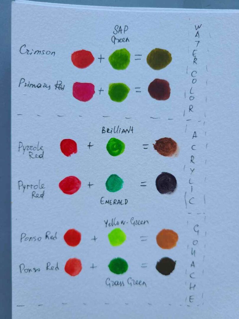
Squeeze a strip of cadmium red beside a ribbon of viridian on a porcelain palette, and the visual tension is immediate. Place them side by side, and the edges vibrate with optical energy; blend them with a palette knife, and that electric contrast collapses into a rich, grounded earth tone. This interaction puzzles beginning painters who expect a vibrant secondary shade and surprises digital designers accustomed to screen displays. How two colors interact depends entirely on whether you manipulate physical molecules of paint or direct streams of photon wavelengths. Understanding this intersection shapes not just fine art, but also how our sensory nervous system processes visual stimuli, a phenomenon explored in detail by a recent Verywell Mind Report on the psychological architecture of human color perception.
Mastering this pairing requires abandoning simple grade-school assumptions about paint. Red and green sit directly across from one another as complementary colors on the standard color wheel. When their opposing wavelengths clash or cancel each other out, they yield everything from warm chestnuts and burnt sienna to deep chromatic blacks and muted olive undertones.
📌 Key Takeaways:
- The Dual System Rule: Physical pigments operate through subtractive color mixing to produce shades of brown, khaki, or gray, while digital light uses the additive color system to generate radiant yellow.
- Complementary Chemistry: Because red is a primary hue and green is a secondary hue made of blue and yellow, combining them brings all three primaries together, systematically neutralizing pigments across the spectrum.
- Ratio Control: Modulating acrylic paint ratios between warm and cool pigment variants allows artists to create custom earth tones without purchasing pre-mixed mud.
The Subtractive Reality: Why Canvas Pigments Turn to Brown and Gray
In the physical world of oil, gouache, watercolor, and acrylic, color relies on subtractive color mixing. Pigments do not emit light. They absorb specific wavelengths from ambient white light and reflect whatever remains back into your eyes.
A tube of cadmium red absorbs short, high-energy wavelengths (blues and violets) and reflects long wavelengths hovering near 620 to 750 nanometers. A tube of phthalo green does the inverse, soaking up longer red wavelengths while bouncing middle frequencies back to the viewer. When you smear these two pastes together, you create a chemical compound that absorbs almost the entire visible spectrum.
Because red sits directly opposite green on the traditional artists' color wheel, green inherently contains the other two primary colors: yellow and blue. Mixing red and green effectively blends red, yellow, and blue simultaneously. When all three primary and secondary colors collide in physical media, broad-spectrum light absorption occurs.
The result is never a radiant purple or an electric orange. Instead, the combination produces a nuanced spectrum of shades of brown, raw umber, deep khaki, or chromatic charcoal. The precise outcome depends on the transparency, tinting strength, and chemical formulation of the paints on your palette.
The Additive Light Paradox: Producing Pure Yellow on Screens
Digital monitors present an entirely different physical phenomenon. Televisions, smartphone screens, and stage lighting do not rely on reflective chemical binders; they emit electromagnetic radiation straight into the human eye using the additive color system.
In this optical space, the RGB vs RYB model dictates visual outcomes. Computer monitors compose imagery from pixels split into red, green, and blue sub-pixels. These match the peak sensitivity ranges of the three types of cone photoreceptors inside the human retina: L-cones (long wavelength, red), M-cones (medium wavelength, green), and S-cones (short wavelength, blue).
When an LED array fires red light (around 650 nanometers) and green light (around 530 nanometers) into the exact same physical space on a glass panel, their light waves combine rather than cancel out. The wavelengths enter the eye simultaneously, stimulating both your L-cones and M-cones in equal measure.
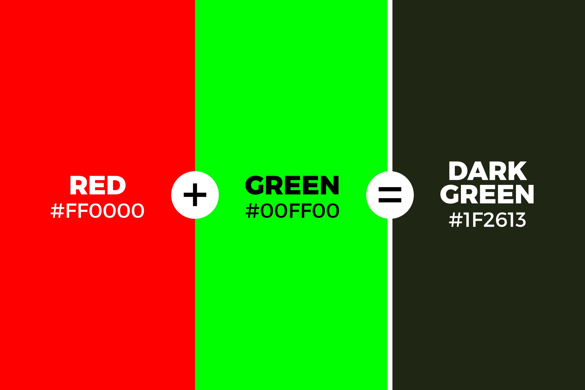
The human visual cortex processes this concurrent stimulation identically to how it reads a single, pure spectral wavelength of yellow light around 580 nanometers. On a digital display, combining maximum red (RGB: 255, 0, 0) and maximum green (RGB: 0, 255, 0) yields absolute, brilliant yellow (RGB: 255, 255, 0).
Understanding this distinction prevents costly mistakes for commercial artists transitioning between digital illustration software and physical print or textile fabrication.
Formulating Earth Tones: Acrylic Paint Ratios and Tested Mixes
Achieving deliberate, professional colors on canvas demands precise ratio management rather than reckless swirling with a wet brush. Depending on whether your red leans warm (yellow-biased, such as Cadmium Red Medium) or cool (blue-biased, such as Quinacridone Magenta), your resulting mixture shifts radically.
A dominant red creates rich mahogany and terracotta; a dominant green establishes muted pine and deep moss. Balancing the two produces dark, moody earth tones ideal for organic landscapes and portrait work.
| Mix Ratio (Red : Green) | Pigment Pairing | Resulting Hue & Undertone | Practical Studio Application |
|---|---|---|---|
| 3:1 (Red-Dominant) | Cadmium Red + Viridian | Warm Chestnut / Burnt Sienna | Sunlit terracotta tiles, brickwork, warm wood grains |
| 1:1 (Equal Balance) | Alizarin Crimson + Phthalo Green | Deep Chromatic Black / Raw Umber | Atmospheric cast shadows; avoids dull ivory black pigment |
| 1:3 (Green-Dominant) | Cadmium Red + Sap Green | Muted Forest / Deep Olive Undertones | Receding foliage, background shrubbery, shadowed moss |
| 1:1 + Titanium White | Burnt Red Ochre + Terre Verte | Warm Slate Gray / Weathered Khaki | Architectural stone, portrait half-tones, overcast clouds |
When working out custom color theory formulas, start with the lighter or weaker pigment on your palette slab. Phthalo green, for instance, possesses immense tinting strength. Adding an equal dollop of standard cadmium red will instantly overwhelm your red; instead, introduce phthalo green into the red in pinhead-sized increments until the mixture settles into your intended shade.
Neutralizing Pigments and Taming Vibrancy in Portraiture
One of the most sophisticated studio techniques involves using red and green as neutralizing agents rather than standalone colors. In classical oil painting techniques, such as the Renaissance verdaccio method, artists built underpaintings using monochromatic, greenish-gray foundations before glazing translucent skin tones over top.
Human flesh is full of subtle chromatic shifts. Skin is not a uniform peach or tan; it contains delicate veins, flushing capillaries, and receding planes. If an area of skin looks garish or oversaturated on the canvas, dumping black or white onto the wet surface creates a dead, chalky patch.
Instead, master portrait painters neutralize an aggressive red cheek or lip by working in a tiny whisper of complementary green.
The green breaks the chroma of the red without flattening its luminous depth. Similarly, olive undertones around the jawline, eye sockets, and temples can be softened by glazing warm, transparent reds over the top. This optical neutralization maintains lifelike vibrancy while grounding the values firmly in natural light.
Selecting Pigments: Chemical Makeup Dictates the Result
A frequent point of frustration for painters is buying two tubes marked "Red" and "Green," mixing them evenly, and ending up with an unattractive, muddy sludge instead of a rich, velvety brown. This happens because paint names on labels often mask the complex chemical behavior of individual pigments.
Modern manufacturers mark professional artist paints with Color Index International codes on the back of each tube. A red labeled "Cadmium Red Medium" contains PR108 (Pigment Red 108), an inorganic compound made from cadmium sulfoselenide. It is completely opaque, highly refractive, and leans gently warm.
In contrast, a red like "Quinacridone Red" carries PR209, an organic synthetic pigment that is transparent, cool, and carries strong violet undertones.
If you blend Cadmium Red (PR108) with Phthalo Green Blue-Shade (PG7), the extreme opacity of the cadmium fights the sheer, aggressive tinting power of the phthalo. The result is a muddy, opaque gray-brown that can easily overpower a delicate glaze.
Pairing transparent Quinacridone Magenta (PR122) with Viridian (PG18) produces a translucent, luminous violet-tinted bronze. Light penetrates through these paint layers, bounces off the white gesso ground below, and travels back through the pigment glaze. The surface looks deep, rich, and full of life.
Always check your paint tubes for their single-pigment listings. When you mix paints made from two or three blended pigments, combining those with a multi-pigment green means your mix now holds five or six separate chemical compounds. That complexity is precisely what turns an intended earth tone into lifeless visual mud.
Frequently Asked Questions (FAQ)
Q1: Why do red and green make brown in paint but yellow on a computer screen?
A1: Paint uses subtractive mixing, where pigments absorb light wavelengths and reflect only what is left over. Blending red and green absorbs almost all visible light, leaving a dark, neutralized brown. Screens use additive mixing, firing separate red and green light rays that stimulate the eye's cones at the same time, prompting the brain to perceive pure yellow.
Q2: How do I mix red and green to make black instead of brown?
A2: Use transparent, cool pigments with intense tinting power. Combine Alizarin Crimson (PR83) or Quinacridone Crimson with Phthalo Green (PG7) in a precise 1:1 balance. This creates a deep chromatic black that offers far more atmospheric depth than flat carbon or ivory tube blacks.
Q3: Which red-green mixture works best for realistic olive skin tones?
A3: Blend Venetian Red or Light Red (inorganic iron oxides) with a hint of Terre Verte (PG23) or muted Sap Green, then adjust the value with Titanium White. The natural earthy base prevents the skin tones from reading as either sickly green or unnaturally sunburned.
Q4: Why does my red-green mixture look chalky?
A4: Chalkiness occurs when you introduce opaque whites (such as zinc or titanium white) too early, or when you use budget student-grade paints stuffed with chalk fillers like calcium carbonate. Keep your red and green mixtures strictly transparent until the base value is correct, and only then add tiny amounts of opaque white to adjust tint.
Mastering Complementary Color Balances in the Studio
Color theory is far more than an academic framework; it is an everyday, practical toolkit for visual problem solving. Whether you are laying down heavy acrylic washes, building up transparent oil glazes, or balancing assets across print and digital media, the dynamic between red and green remains foundational.
Treating these complementary hues as dynamic partners gives you total control over your palette. By letting go of generic pre-mixed tubes and mixing your own earth tones, you unlock rich chestnuts, complex foliage greens, and deep chromatic shadows that bring genuine depth, harmony, and discipline to your creative work.
